WCAG 2.2 AA explained
What's new and what it means for your website

WCAG 2.2 AA explained: What's new and what it means for your website
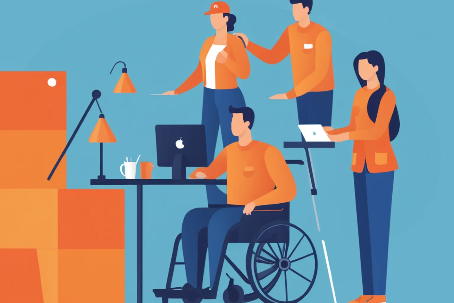
In October 2023, the World Wide Web Consortium published WCAG 2.2, the latest version of the Web Content Accessibility Guidelines. For most organizations, the target remains Level AA—the standard referenced by the Department of Justice, the European Accessibility Act, and most accessibility laws worldwide .
WCAG 2.2 adds nine new success criteria to the 78 that existed in WCAG 2.1, while removing one that became obsolete. The new requirements focus on three areas where users still face barriers: keyboard navigation and focus visibility, mobile and touch interactions, and cognitive load during form completion and authentication .
Here's what you need to know about each new criterion, how to implement it, and what the updated standard means for your compliance work.
WCAG 2.2 is backward compatible. Everything that was required in WCAG 2.1 remains required, with one exception. Success Criterion 4.1.1 Parsing was removed because modern browsers and assistive technologies handle parsing issues automatically .
The nine new criteria break down by level:
- Level A (2 new): Consistent Help, Redundant Entry
- Level AA (4 new): Focus Not Obscured (Minimum), Focus Appearance, Dragging Movements, Target Size (Minimum)
- Level AAA (3 new): Focus Not Obscured (Enhanced), Accessible Authentication (Minimum), Accessible Authentication (Enhanced)
For organizations targeting WCAG 2.2 AA compliance, you need to meet six new requirements beyond WCAG 2.1 AA .
New criteria for keyboard users: focus visibility
Three new criteria address problems that keyboard users have faced for years—focus indicators that disappear, get hidden by sticky headers, or are too faint to see.
2.4.11 Focus Not Obscured (Minimum) — Level AA
The requirement: When a component receives keyboard focus, at least part of it must remain visible and not be hidden by author-created content like sticky headers, chat widgets, or cookie banners .
What this means in practice: If your site has a fixed header that stays at the top of the page, and a user tabs to a link that scrolls behind that header, you've failed this criterion. The focused element is completely hidden.
Common violations:
- Fixed navigation covering focused links
- Chat widgets overlapping form fields
- Cookie consent banners hiding footer links
- Sticky CTAs covering interactive elements
Implementation:
css
/* Account for sticky header height */ html { scroll-padding-top: 80px; /* Height of your sticky header */ } /* Ensure focused elements scroll into view */ :focus { scroll-margin-top: 100px; }
2.4.12 Focus Not Obscured (Enhanced) — Level AAA
The requirement: When a component receives keyboard focus, no part of the focus indicator may be hidden by author-created content .
This is stricter than 2.4.11. The minimum level allows partial obscuring—you just need to see some part of the focused element. The enhanced level requires the entire focused element to be completely visible .
2.4.13 Focus Appearance — Level AAA
The requirement: When keyboard focus indicators are visible, they must meet specific size and contrast requirements. The focus indicator area must be at least as large as a 2 CSS pixel thick perimeter of the unfocused component, and must have a contrast ratio of at least 3:1 between focused and unfocused states .
What this means: Thin dotted outlines often fail. Low-contrast custom focus styles fail. The UK Government Design System's pattern of a yellow background with black underline fails under this criterion because it doesn't extend to a 2px perimeter around the element .
Implementation:
css
/* WCAG 2.2 compliant focus indicator */ :focus-visible { outline: 3px solid #005fcc; outline-offset: 2px; } /* For dark backgrounds */ .dark-section :focus-visible { outline-color: #ffffff; box-shadow: 0 0 0 3px #005fcc; }
Never do this:
css
/* DON'T remove focus indicators without replacement */ :focus { outline: none; /* Accessibility failure */ }
New criteria for motor disabilities: touch targets and dragging
Two new criteria address the needs of users with motor disabilities, particularly those using touch devices.
2.5.7 Dragging Movements — Level AA
The requirement: All functionality that uses dragging movements must also be operable with a single pointer without dragging, unless dragging is essential .
What this means: Drag-and-drop interfaces must have alternatives. Users with motor impairments may not be able to perform drag gestures. Provide buttons, taps, or clicks as alternatives.
Common violations:
- Sortable lists requiring drag-and-drop
- Image cropping interfaces without button controls
- Sliders without keyboard or touch alternatives
- File upload drop zones without click alternative
- Kanban boards with drag-only card movement
Implementation:
html
<!-- Sortable list with button alternatives --> <ul role="list" aria-label="Sortable items"> <li> <span>Item 1</span> <button aria-label="Move Item 1 up">↑</button> <button aria-label="Move Item 1 down">↓</button> </li> </ul> <!-- Slider with increment buttons --> <div role="group" aria-label="Price range"> <button aria-label="Decrease minimum price">−</button> <input type="range" aria-label="Minimum price"> <button aria-label="Increase minimum price">+</button> </div>
For e-commerce sites, this affects product image reordering, wishlist management, and cart quantity adjustments that might use drag interfaces .
2.5.8 Target Size (Minimum) — Level AA
The requirement: Interactive targets must be at least 24 by 24 CSS pixels, with specific exceptions for inline links, user agent controlled elements, and essential presentations .
What this means: Buttons, links, and controls need adequate touch and click target size. Small icon buttons, tightly packed navigation links, and tiny close buttons on modals all fail.
Exceptions:
- Inline targets (links within text)
- User agent controlled elements
- Essential presentations where size is legally required
- Spacing alternative: undersized targets can pass if a 24px circle centered on each doesn't intersect another
Implementation:
css
/* Ensure minimum target size */ button, a:not(.inline-link), [role="button"] { min-width: 24px; min-height: 24px; } /* Icon buttons need explicit sizing */ .icon-button { width: 44px; /* Recommended for touch */ height: 44px; display: inline-flex; align-items: center; justify-content: center; } /* Spacing alternative for compact layouts */ .compact-nav a { padding: 12px; /* Creates 24px+ effective target */ }
New criteria for cognitive disabilities: help, redundant entry, authentication
Three new criteria address cognitive load, helping users with cognitive and learning disabilities complete tasks successfully.
3.2.6 Consistent Help — Level A
The requirement: If help mechanisms (human contact details, contact mechanisms, self-help options, automated contact) are provided on multiple pages, they must appear in the same relative order .
What this means: Help options should be predictably located. If your contact link is in the footer on your homepage, it shouldn't move to the header on your product page. Users with cognitive disabilities rely on consistency to find what they need.
Implementation:
- Place help links in the same position across all pages
- Use consistent labeling for help mechanisms
- Keep contact information in predictable locations
- If using a chat widget, ensure it appears in the same corner on every page
3.3.7 Redundant Entry — Level A
The requirement: Information previously entered by the user that is required again in the same process must be either auto-populated or available for selection. Exceptions exist for security-sensitive information and cases where re-entry is essential .
What this means: Don't make users enter the same information twice. If you ask for a shipping address and then a billing address, provide a checkbox option to copy the shipping address. If you ask for an email at the start of a multi-step form, don't ask for it again on the next page.
Common violations:
- Checkout requiring re-entry of shipping address for billing
- Multi-step forms asking for name and email on multiple pages
- Confirmation screens requiring re-entry of previously provided data
- Account creation flows repeating information requests
Implementation:
html
<!-- Auto-populate billing from shipping --> <input type="checkbox" id="same-address"> <label for="same-address">Billing address same as shipping</label> <!-- Pre-fill from previous step --> <input type="email" value="{{previouslyEnteredEmail}}" aria-describedby="email-note"> <span id="email-note">Pre-filled from previous step</span> <!-- Support autocomplete --> <input type="email" autocomplete="email">
3.3.8 Accessible Authentication (Minimum) — Level AA
The requirement: Cognitive function tests (remembering passwords, solving puzzles, recognizing objects) are not required for authentication unless alternatives exist. The criterion provides four ways to pass :
- Alternative authentication method that doesn't rely on cognitive function tests
- Mechanism to assist the user (like password manager support)
- Object recognition test (identifying objects in images)
- Personal content test (identifying content the user previously provided)
What this means: Don't rely solely on memory or cognitive tests for login. CAPTCHAs that require users to transcribe distorted text fail unless there's an audio alternative. Password fields that block paste fail. Security questions requiring recall fail.
Implementation:
html
<!-- Support password managers --> <input type="email" autocomplete="username email" aria-label="Email address"> <input type="password" autocomplete="current-password" aria-label="Password"> <!-- Allow paste in password fields --> <!-- DON'T add onpaste="return false" --> <!-- Provide CAPTCHA alternatives --> <div role="group" aria-label="Verification"> <p>Please complete one verification method:</p> <button>Audio CAPTCHA</button> <button>Email verification code</button> </div>
3.3.9 Accessible Authentication (Enhanced) — Level AAA
The requirement: No cognitive function test is required for any step of authentication. Object recognition and personal content recognition are not allowed, even as alternatives .
What this means: At this level, you cannot use any form of CAPTCHA that requires cognitive processing. Passwordless authentication, email magic links, or biometric alternatives are required.
The removed criterion: 4.1.1 Parsing
WCAG 2.1 included a requirement that elements have complete start and end tags, be nested correctly, and not contain duplicate attributes. This was intended to ensure assistive technologies could parse content correctly.
The criterion was removed because modern browsers and assistive technologies handle parsing robustly. Validation errors rarely cause accessibility failures in practice .
This doesn't mean HTML validation is worthless—it still helps with quality and maintenance—but it's no longer an accessibility requirement.
What this means for your compliance work
If you're already WCAG 2.1 AA compliant
You're most of the way there. WCAG 2.2 AA adds six new requirements. You'll need to audit your site against these criteria and fix any violations .
Priority areas to check:
Focus visibility: Test with keyboard navigation. Do sticky headers or chat widgets ever hide focused elements? Add scroll padding and margin to ensure focused elements are visible .
Focus appearance: Review your focus indicators. Are they at least 2px thick? Do they have 3:1 contrast against unfocused states? If you removed default outlines, did you replace them with visible alternatives?
Touch targets: Measure buttons and interactive elements. Are they at least 24x24px? If not, does spacing between small targets meet the exception requirements?
Dragging interactions: Identify any drag-and-drop functionality. Does it have single-click alternatives? Can users reorder lists without dragging?
Form redundancy: Walk through multi-step processes. Are you asking for the same information twice? Add pre-fill or copy options where appropriate .
Authentication: Test your login process. Does it rely on cognitive tests? Can users paste passwords? Do you support password managers? If using CAPTCHA, is there an accessible alternative?
Help consistency: If you have help links, contact forms, or chat widgets, are they in consistent locations across all pages?
Legal and regulatory context
Most current accessibility regulations still reference WCAG 2.0 or 2.1. The DOJ's April 2024 Title II rule adopted WCAG 2.1 Level AA as the standard for state and local governments. Section 508 references WCAG 2.0. The European Accessibility Act references EN 301 549, which currently incorporates WCAG 2.1 .
However, this is shifting. The UK public sector must meet WCAG 2.2 AA. EN 301 549 is expected to adopt WCAG 2.2 in 2025. Several U.S. states, including Colorado, have expressed intent to update to WCAG 2.2 .
The practical guidance from multiple sources is consistent: WCAG 2.2 AA represents current best practice. Meeting it positions you ahead of regulatory changes and reduces lawsuit risk .
The overlay problem
The Federal Trade Commission fined AccessiBe $1 million for deceptive claims about its overlay's ability to achieve compliance . The Overlay Fact Sheet, signed by over 700 accessibility professionals, states overlays don't fix underlying code problems .
None of the new WCAG 2.2 criteria can be satisfied by overlays. Focus visibility, touch targets, dragging alternatives, and accessible authentication require code-level fixes, not JavaScript patches.
Testing for WCAG 2.2 AA
Automated testing
Automated tools detect about 30 to 40 percent of accessibility issues . For WCAG 2.2, they can identify:
- Missing focus indicators
- Target size violations
- Obscured elements (with some limitations)
- Redundant entry patterns
- Missing autocomplete attributes
Manual testing required
Some criteria require human judgment and testing:
- Focus order logic and appropriateness
- Content quality of help mechanisms
- Whether drag alternatives are genuinely usable
- Whether authentication alternatives work for real users
- Consistent help placement across all pages
Specific tests to run
Keyboard test: Unplug your mouse. Navigate your entire site using only Tab, Shift+Tab, Enter, Space, and arrow keys. Watch for obscured focus, missing focus indicators, and keyboard traps .
Touch test: On a mobile device, try to tap every interactive element. Are any too small? Do you accidentally tap neighboring elements?
Multi-step form test: Complete any multi-step processes. Are you asked for the same information twice? Can you copy from previous steps?
Login test: Attempt to log in using a password manager. Can you paste into password fields? Is CAPTCHA usable?
Help test: Navigate to several different pages. Are help mechanisms in consistent locations? Can you find contact information easily?
The bottom line
WCAG 2.2 AA adds nine new success criteria focused on focus visibility, touch interactions, and cognitive accessibility. For organizations already meeting WCAG 2.1 AA, the path to 2.2 AA requires addressing six new requirements.
The new criteria address real barriers that users have faced for years—focus indicators that disappear behind sticky headers, drag-only interfaces, tiny touch targets, repetitive form entry, and authentication that assumes perfect memory and vision.
Implementation requires code-level fixes. Scroll padding for obscured focus. Larger touch targets. Button alternatives for dragging. Pre-filled form fields. Password manager support. Consistent help placement.
Most legal requirements haven't caught up to WCAG 2.2 yet, but they will. The UK already requires it. Europe's standard will likely update in 2025. States are signaling intent.
The practical approach: audit against WCAG 2.2 AA now, fix violations, and document your work. You'll be ahead of regulatory changes, reduce lawsuit risk, and actually improve your site for users who rely on accessible design.